Extensibility
Extending Elsa Studio with plugins
The Elsa Studio application can be extended using Elsa Plugins, which are JavaScript functions implementing a particular signature and are registered with Elsa Studio.
Plugins allow you to extend the studio with features such as:
- Intercept outgoing HTTP requests to add e.g. authorization headers
- Custom activity icons
- Custom activity design-time behavior (e.g. dynamic outcomes as is seen with
ForkandSwitch) - Custom field types
Although you can use frameworks such as Angular, React and even Stencil to extend Elsa Studio, you don't have to. Vanilla JS works just as well.
When you're implementing more advanced features, such as custom field types however, you may want to take advantage of JS frameworks to more easily implement reactive input behavior.
Custom Plugins
At a bare minimum, implementing a plugin requires nothing more than declaring a function and then registering this function with Elsa Studio.
The following shows a minimal example of a plugin that does nothing more than showing an alert message when the plugin is initialized:
function MyPlugin() {
    alert('I am initializing!');
}
To register this plugin, you need a reference to the <elsa-studio-root> element and add an event handler for its initializing event:
<elsa-studio-root server-url="https://localhost:11000" monaco-lib-path="build/assets/js/monaco-editor/min" culture="en-US">
    <elsa-studio-dashboard></elsa-studio-dashboard>
</elsa-studio-root>

<script>
    const elsaStudioRoot = document.querySelector('elsa-studio-root');

    elsaStudioRoot.addEventListener('initializing', e => {
        const elsaStudio = e.detail;
        elsaStudio.pluginManager.registerPlugin(MyPlugin);
    });
</script>
Plugins can accept an optional parameter called elsaStudio, which provides access to various other services such as eventBus, pluginManager and more:
export interface ElsaStudio {
  serverUrl: string;
  basePath: string;
  pluginManager: PluginManager;
  propertyDisplayManager: PropertyDisplayManager;
  elsaClientFactory: () => ElsaClient;
  httpClientFactory: () => AxiosInstance;
  eventBus: EventBus;
  activityIconProvider: ActivityIconProvider;
  confirmDialogService: ConfirmDialogService;
  toastNotificationService: ToastNotificationService;
  getOrCreateProperty: (activity: ActivityModel, name: string, defaultExpression?: () => string, defaultSyntax?: () => string) => ActivityDefinitionProperty
}
Intercept Outgoing HTTP Requests
A common use case for a plugin is to intercept outgoing HTTP requests made from Elsa Studio to Elsa Server and add authorization headers. This is necessary when you place Elsa Server behind a proxy server for example that requires authentication, or when you use ASP.NET Core Security Middleware to protect your server.
Since Elsa Studio uses Axios, it is possible to install Axios middleware that adds authorization headers to outgoing HTTP request. The following code snippet demonstrates a plugin that installs Axios middleware that adds an authorization headers:
function AuthorizationMiddlewarePlugin(elsaStudio) {
    const eventBus = elsaStudio.eventBus;

    eventBus.on('http-client-created', e => {
        // Register Axios middleware.
        e.service.register({
            onRequest(request) {
                request.headers = {'Authorization': 'Bearer 1234'}
                return request;
            }
        });
    });
}
Checkout the Axios Middleware documentation for an example of a middleware that automatically retries the request if a 401 response is returned.
Custom Activity Icons
You created a custom activity in C#, and now you want to use a custom icon for it when displayed in Elsa Studio. Ho do you do it?
By creating a plugin, of course!
To register an icon for a given activity type, use the activityIconProvider service made available through the elsaStudio plugin parameter. The icon is provided in the form of HTML markup of your choosing. The icons provided by Elsa Studio all use Tailwind CSS classes and SVG to render an icon. A great source for finding compatible icons can be found at Tailwind Toolbox.
For example, if you created a ThumbsUp activity, you can register its icon with the following custom plugin:
function ThumbsUpPlugin(elsaStudio) {
    elsaStudio.activityIconProvider.register(
        'ThumbsUp',
        `<span class="elsa-rounded-lg elsa-inline-flex elsa-p-3 elsa-bg-blue-50 elsa-text-blue-700 elsa-ring-4 elsa-ring-white">
            <svg class="elsa-h-6 elsa-w-6" stroke-width="2" stroke="currentColor" fill="none" stroke-linecap="round" stroke-linejoin="round">
                <path d="M14 9V5a3 3 0 0 0-3-3l-4 9v11h11.28a2 2 0 0 0 2-1.7l1.38-9a2 2 0 0 0-2-2.3zM7 22H4a2 2 0 0 1-2-2v-7a2 2 0 0 1 2-2h3" />
            </svg>
        </span>`);
}
With this plugin registered, it will display the thumbs-up icon for your custom ThumbsUp activity.
Dynamic Outcomes
Sometimes your custom activities might yield dynamic outcomes depending on the values of some activity property. A good example of this is the Fork activity. When you add this activity, you specify a list of branches that are then displayed on the designer as outcomes.
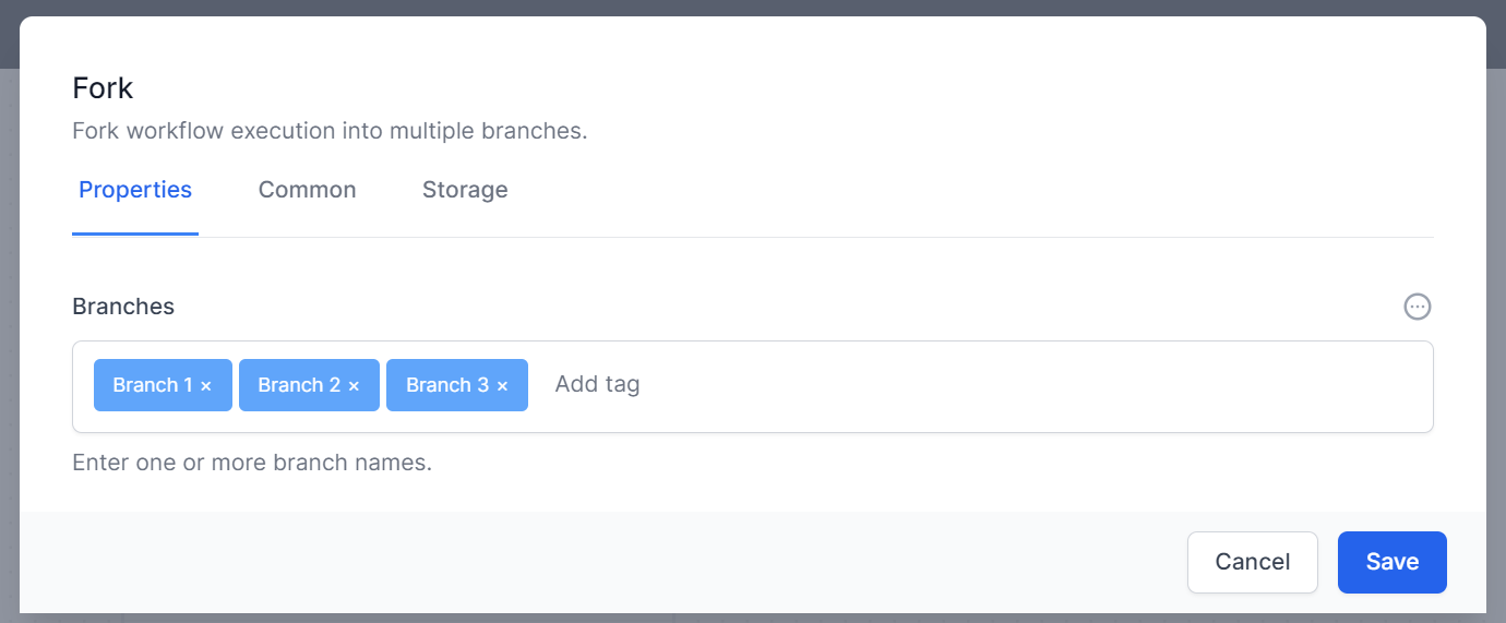
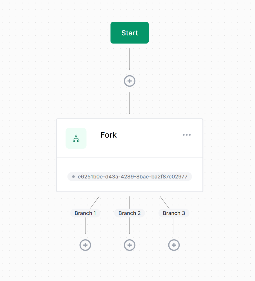
To implement this dynamic behavior, you need to create a plugin for your custom activity that does the following things:
- Handle the
'activity-design-displaying'event bus event. - Check to see if the current activity being displayed is your custom activity.
- If so, get the value representing your dynamic outcomes. For example, the property of the
Forkactivity holding the list of branches is calledBranchesand is stored as an array. - Set the
outcomesproperty of thecontextparameter received as part of the event handler.
For example, let's say you have the following custom activity defined in C#:
public RandomizeOutcome : Activity
{
   [ActivityInput(
        Hint = "Enter one or more outcome names.",
        UIHint = ActivityInputUIHints.MultiText,
        DefaultSyntax = SyntaxNames.Json,
        SupportedSyntaxes = new[] { SyntaxNames.Json },
        IsDesignerCritical = true
    )]
    public ISet<string> PossibleOutcomes { get; set; } = new HashSet<string>();
}
Then the corresponding designer plugin might look like this:
function RandomizeOutcomePlugin(elsaStudio) {
    const {eventBus} = elsaStudio;
    eventBus.on(EventTypes.ActivityDesignDisplaying, this.onActivityDesignDisplaying);

    this.onActivityDesignDisplaying = context => {
        const activityModel = context.activityModel;

        // Only handle RandomizeOutcome activities.
        if (activityModel.type !== 'RandomizeOutcome')
            return;

        const props = activityModel.properties || [];
        const syntax = SyntaxNames.Json;

        // Get the value stored in the `PossibleOutcomes` property.
        // Keep in mind that activity properties are stored in a dictionary of expressions, keyed by syntax.
        const possibleOutcomes = props.find(x => x.name == 'PossibleOutcomes') || {expressions: {'Json': '[]'}, syntax: syntax};
        const expression = possibleOutcomes.expressions[syntax] || [];

        // Set the outcomes property of the `context` argument to the list of possible outcomes.
        // Due to the way expressions are serialized depending on the syntax used, we need to check for a couple of formats in order to get the array.
        context.outcomes = !!expression['$values'] ? expression['$values'] : Array.isArray(expression) ? expression : parseJson(expression) || [];
    }
}
When you register the above plugin, your custom plugin will now display outcomes based on the value of the PossibleOutcomes property.
Custom Field Types
Out of the box, Elsa Studio provides the following input control types:
- single-line
- multi-line
- json
- check-list
- radio-list
- checkbox
- dropdown
- multi-text
- code-editor
- switch-case-builder
These types relate directly to the UIHint property specified on the ActivityInputAttribute when declaring an activity property. For example, the WriteLine activity uses the single-line UI hint for its Text property.
The
UIHintis automatically determined based on the property type. Forstringtypes such as theTextproperty ofWriteLine, thesingle-lineis used by default. To use a different UI hint, specify theUIHintproperty explicitly.
To implement a custom input control, you need to do the following:
- Think of a name for the UI hint. E.g.
'my-custom-input'. - Implement a driver for your custom input control.
- Create a plugin that registers the custom driver.
The following code demonstrates these steps.
function MyCustomInputDriver(elsaStudio) {

    // Get convenience methods.
    const {getOrCreateProperty, htmlToElement} = elsaStudio;

    // Implement the display method, which receives the activity model and the property for which the editor must be rendered.
    this.display = (activity, property) => {
        // Get the property model.
        const propertyModel = getOrCreateProperty(activity, propertyDescriptor.name);

        // Get the configured default syntax name.
        const defaultSyntax = propertyDescriptor.defaultSyntax || 'Literal';

        // Get the current property value for the default syntax.
        const currentValue = propertyModel.expressions[defaultSyntax] || '';

        // Create a property editor element (for displaying label, hint and syntax toggle).
        // This will wrap our custom control.
        const propertyEditor = document.createElement('elsa-property-editor');

        // Our custom input element control. Can be anything you want.
        // Using HTML string to easily construct an actual element object.
        // Better yet would be to implement a component with Stencil, Angular or React if you;re using any of these frameworks.
        const inputHtml =
            `<input type="text"
                   class="disabled:elsa-opacity-50 disabled:elsa-cursor-not-allowed focus:elsa-ring-blue-500 focus:elsa-border-blue-500 elsa-block elsa-w-full elsa-min-w-0 elsa-rounded-md sm:elsa-text-sm elsa-border-gray-300"
                   value="${currentValue}"
                />`;

        // Create an actual input element from the HTML string.
        const inputElement = htmlToElement(inputHtml);

        // Add the custom input control element to the property editor as a child.
        propertyEditor.append(inputElement);

        // Initialize the property editor.
        propertyEditor.propertyDescriptor = propertyDescriptor;
        propertyEditor.propertyModel = propertyModel;

        // Setup change handler for custom control that updates the property model.
        inputElement.addEventListener('change', (e) => {
            const input = e.currentTarget;
            propertyModel.expressions[defaultSyntax] = input.value;
        });

        // return the created custom control.
        return propertyEditor;
    };
}
Although it's not required, the above code listing wraps the custom <input> element with the <elsa-property-editor> component. This is convenient, because this allows the user to then switch between different supported syntaxes such as JavaScript and Liquid. The custom input driver also takes care of handling change events of the custom control. In most scenarios however, you might want to encapsulate all that into a separate component. Elsa Studio for example implements all of the control specifics into dedicated components, keeping the driver logic as simple as simply returning a configured custom element.
For example, the driver for the single-line UI hint looks like this:
export class SingleLineDriver implements PropertyDisplayDriver {

  display(activity: ActivityModel, property: ActivityPropertyDescriptor) {
    const prop = getOrCreateProperty(activity, property.name);
    return <elsa-single-line-property propertyDescriptor={property} propertyModel={prop}/>;
  }
}
Now that we have a custom input driver, we need to register it with Elsa Studio. To do that, create a plugin that looks like this:
// Custom input control driver plugin:
function MyCustomInputPlugin(elsaStudio) {
    // Register custom driver.
    elsaStudio.propertyDisplayManager.addDriver('my-custom-input', () => new MyCustomInputDriver(elsaStudio));
}
Notice that when registering a driver, you register a function that constructs an instance of said driver.
With that in place (make sure to register your plugin), you can now declare activity properties with the 'my-custom-input' UI hint like this:
[ActivityInput(UIHint = "my-custom-input", SupportedSyntaxes = new[] { SyntaxNames.JavaScript, SyntaxNames.Liquid })]
public string Subtext { get; set; }